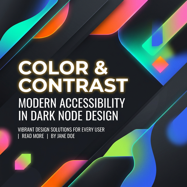
Color contrast checks are one of the fastest ways to catch accessibility problems before they spread across a design system. The challenge is that many teams test one hero color pair, then miss the quieter UI states where contrast fails in practice.
This guide focuses on the real workflow: what to test, how AA and AAA differ, and how to think about gradients, button states, and small text without turning contrast into a box-ticking exercise.
What contrast checking is really measuring
Contrast checking measures the difference in perceived luminance between a foreground color and its background. In practical terms, it answers whether text or interface elements will remain readable for more people, including users with lower vision or poor lighting conditions.
The important point is that contrast is always about a pair. A brand color does not pass or fail on its own. It passes or fails only against the specific background where it is used.
AA, AAA, and the large-text exception
AA is the baseline most digital products aim to meet. AAA is stricter and can be useful for reading-heavy or highly accessible interfaces, but it is not always realistic for every visual style.
Large text has a lower threshold because bigger letters are easier to read. That is why a color pair might be acceptable for a hero heading and still fail for body copy, helper text, or small labels.
- Normal body text needs more contrast than large headings
- Muted labels and helper text often fail before primary text does
- Secondary and disabled states should be tested separately
What teams forget to test
The biggest misses usually happen outside the main UI path: hover states, placeholder text, tags, icons on tinted backgrounds, and buttons that change color after interaction. Those are easy to skip when contrast is only checked once during initial design.
Gradients and images need extra care because the background is not one color. The best approach is to test the lightest and darkest areas behind the text separately.
A simple repeatable workflow
Start with the final foreground and background pair, not a rough approximation from the design file. Check body text first, then headings, then interactive states, and finally any gradient or image-backed surfaces.
Once the pair passes, document it as part of the design system so the same accessible combination can be reused instead of rediscovered later.
Khushbu
Full-Stack Developer & Founder
I build tools I wish existed — fast, free, and private. Every tool runs in your browser because I believe your data should stay yours.
Tools mentioned in this guide