
Gradients can lift a UI quickly, but they can also make a page feel noisy or unfinished if the colors, stop positions, or surrounding elements are not doing clear work. The goal is not to add more color. It is to add depth, hierarchy, or emphasis deliberately.
This guide covers the practical side of gradients: where they work well, where they usually go wrong, and how to keep them readable and production-friendly.
Use gradients to support hierarchy
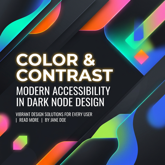
The strongest gradients usually reinforce a layout decision. They can separate a hero from the rest of the page, make a CTA stand out, or add a sense of atmosphere behind a section without competing with the content itself.
When gradients are used everywhere at once, they stop creating hierarchy and start acting like decoration. Restricting them to a few intentional surfaces often produces a stronger UI.
Watch stop placement and brightness
Many gradients feel harsh because the stop positions are too abrupt or the colors shift too aggressively in brightness. Small adjustments to angle and stop spacing often create a more polished result than changing the colors entirely.
A useful rule is to test the gradient at the actual size where it will appear. A blend that looks smooth in a tiny preview can feel very different when stretched across a full hero section.
Readability matters more than trendiness
Text over gradients should be checked against the lightest and darkest areas behind it. A pair that looks fine in the center of the preview can fail near an edge or stop transition.
If the gradient needs to carry body text, simplify it. Strong multi-color blends are better for backgrounds and accents than for long passages of readable content.
- Use stronger gradients for backgrounds, not dense reading blocks
- Check heading and button text separately from body copy
- Test the final layout, not only the generator preview
Pair gradients with the rest of the UI
Gradients rarely work alone. They look more cohesive when the palette, shadow treatment, and shape language support the same direction. That is why gradient work often sits next to palette generation and box-shadow tuning in the same workflow.
Once the blend looks good, move it into real components and check whether it still feels intentional with your typography, cards, and interactions around it.
Khushbu
Full-Stack Developer & Founder
I build tools I wish existed — fast, free, and private. Every tool runs in your browser because I believe your data should stay yours.
Tools mentioned in this guide